Top

JKOPay
My Role: UI/UX Designer
Led the Android UI redesign, enhancing usability and visual consistency in a fintech platform.
About JKOPay: JKOPay is one of Taiwan’s leading mobile payment platforms, offering seamless transactions while complying with strict financial regulations.
My role focused on improving cross-platform UI consistency and redesigning key features, including Money Transfers and Red Envelopes.
Timeline
2018-2019
Industry
FinTech
Company size
100+
Tools
Sketch, Zeplin, Photoshop, Illustrator, Jira
Challenge
The previous UI design used a single file for both iOS and Android, causing inconsistencies due to platform-specific behaviors.
Taiwan’s Financial Supervisory Commission (FSC) required a strict approval process, limiting flexibility in UI and user flow adjustments.
Results
After we launched the redesigned interface, the number of active users increased by around 20%.
We also checked in with the customer service team, and they confirmed that complaints about the transfer flow significantly dropped within six months of the update.
As a design team, this was especially meaningful to us — because our core mission was to reduce behavior inconsistencies between iOS and Android, and improve usability through a more unified interface.
We also used this project to gradually improve our design process, including component naming, spec delivery, and working more closely with engineers.
While I left the company after this launch, I later heard that the team continued to evolve the backend and design system. Which made me proud to have contributed to that foundation.
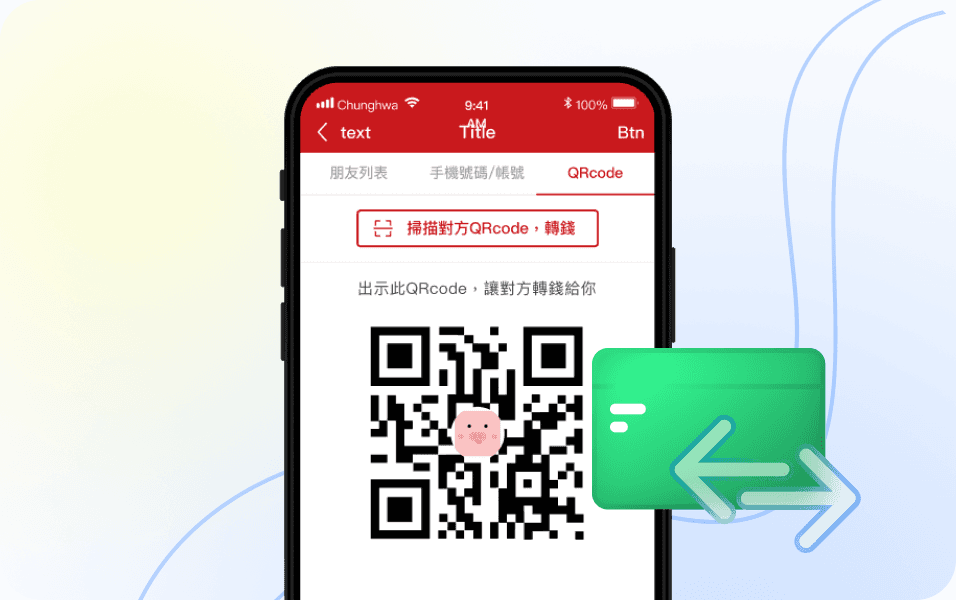
Key Projects: Money Transfer
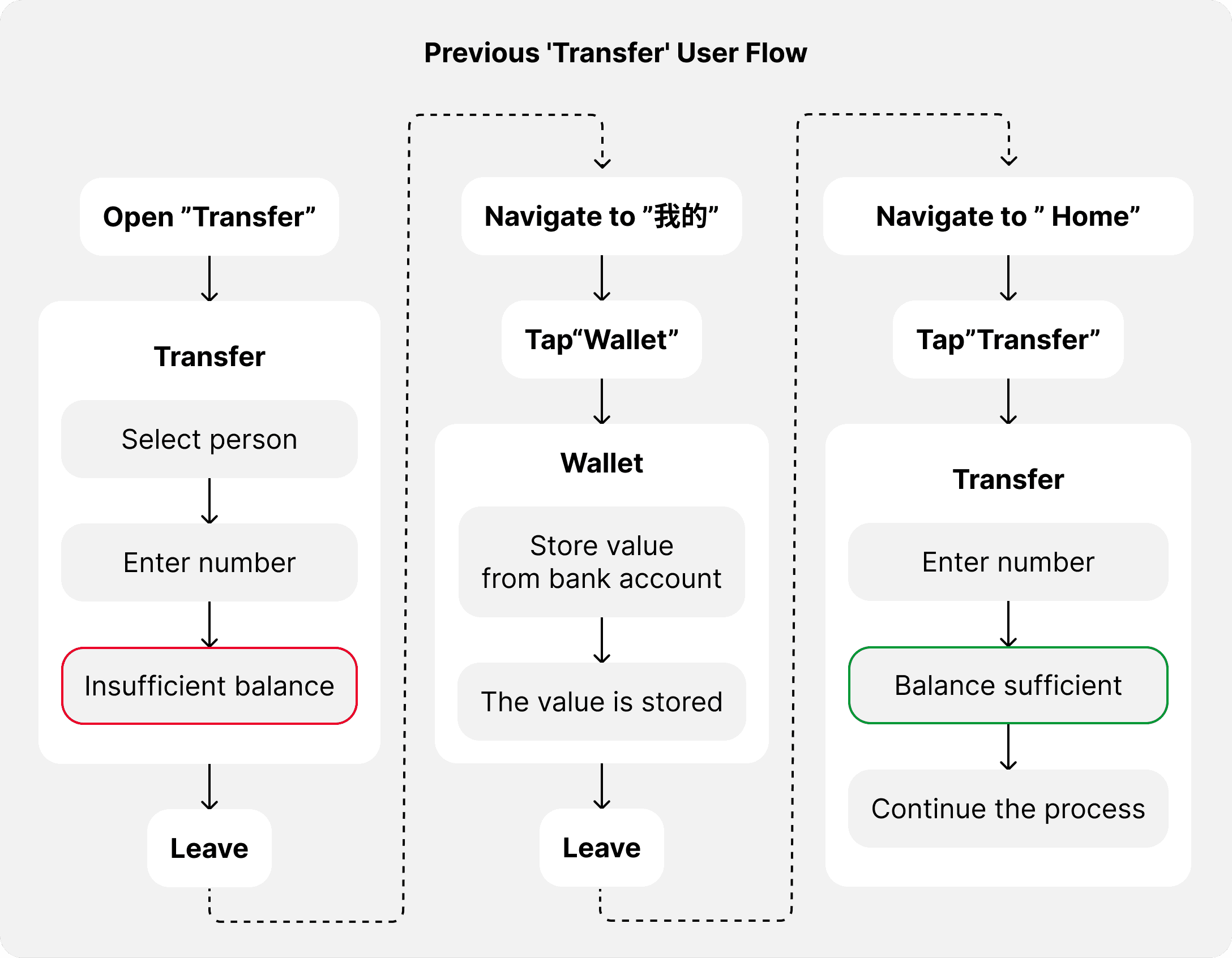
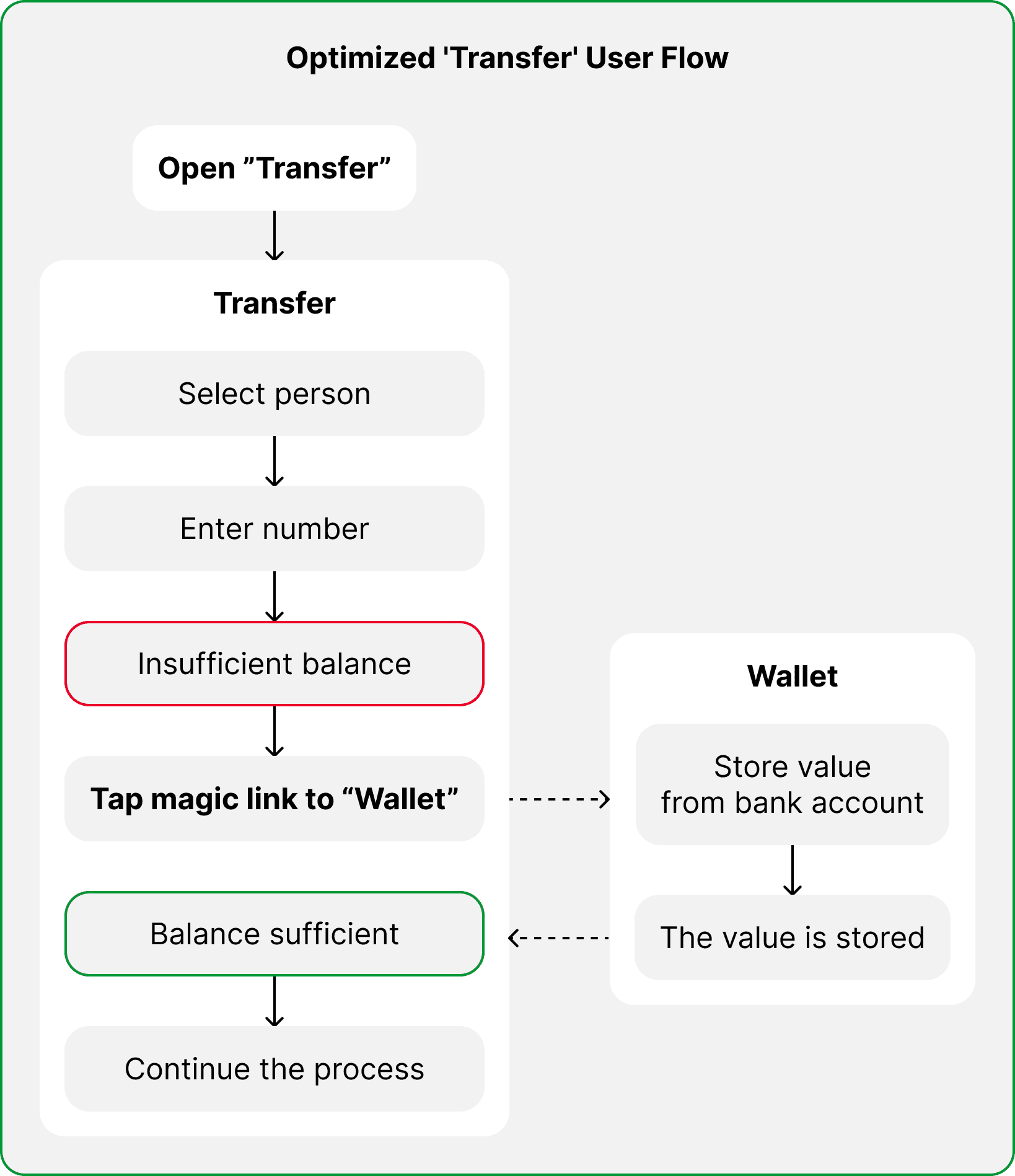
While working on the UI redesign, I noticed that the existing transfer flow required users to exit the app to deposit funds when there was an insufficient balance, and that made the process unnecessarily long. Recognizing this friction point, I proposed a simple adjustment, integrating a door to deposit within the transaction process.
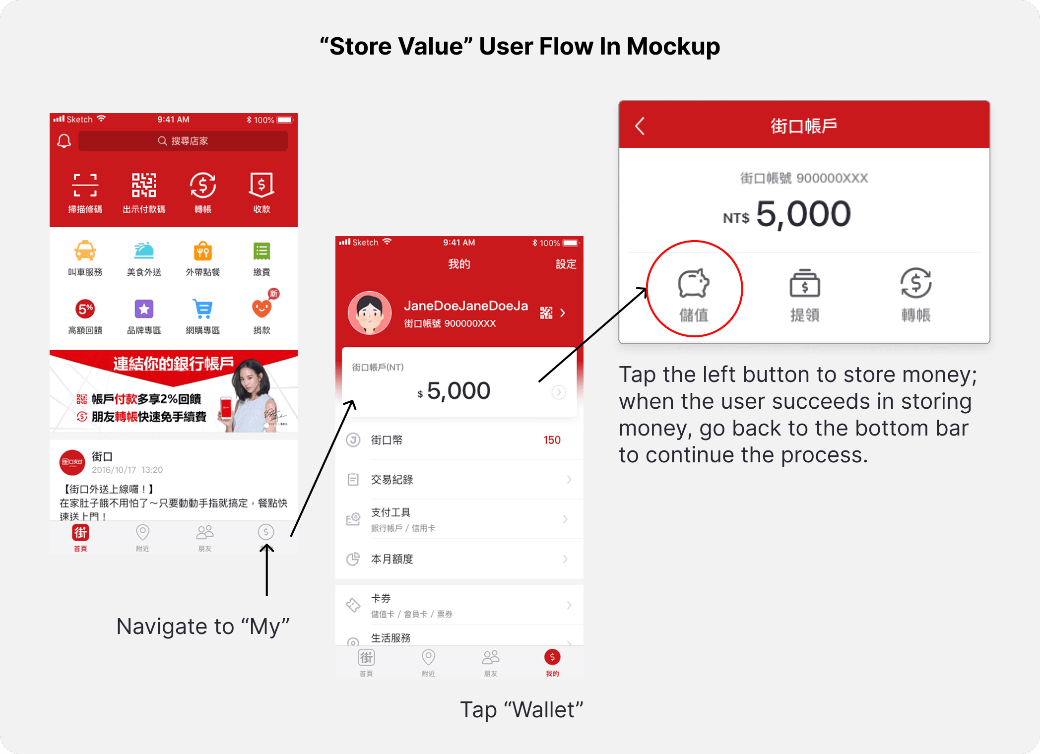
When the system automatically checks for insufficient balance, users must exit the app to deposit funds before completing a transfer.
The system only provided reminders, lacking an intuitive way to guide users.
Although changing the user flow was not part of the project scope, I still suggest changing this flow based on my observations while I am testing the prototype. After discussions with the PM and developers, we agreed with this improvement, making the process more seamless for users.
This was my first initiative to improve UX, and I am very happy my team members accepted the idea. I feel the collaboration and communication were really important, and I feel a lot of achievements from implementing the changes with the team.
A few months after launch, the PM shared internal feedback confirming that this small UX change contributed to a smoother user experience. By reducing unnecessary steps, we minimized transaction drop-offs and improved the overall flow.
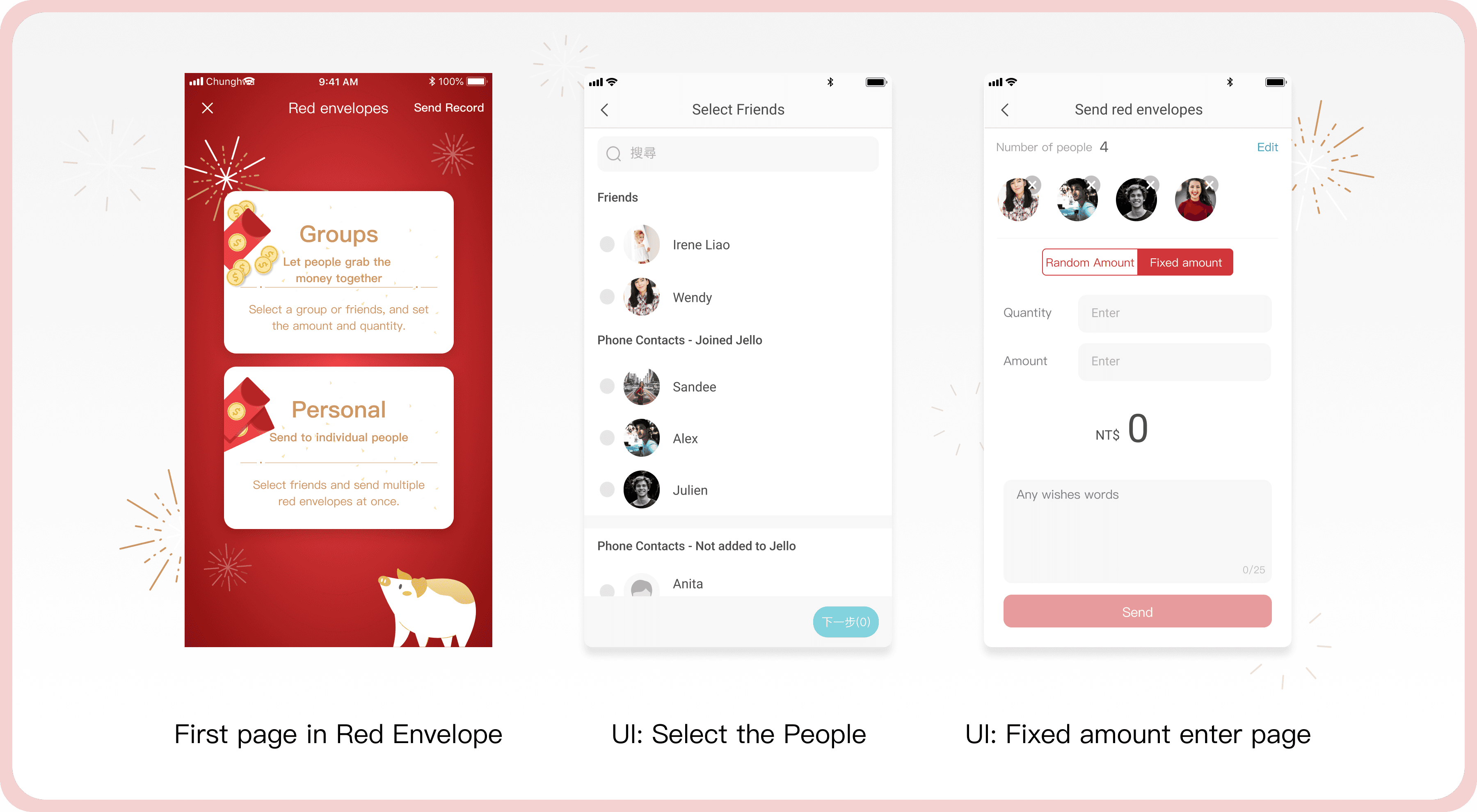
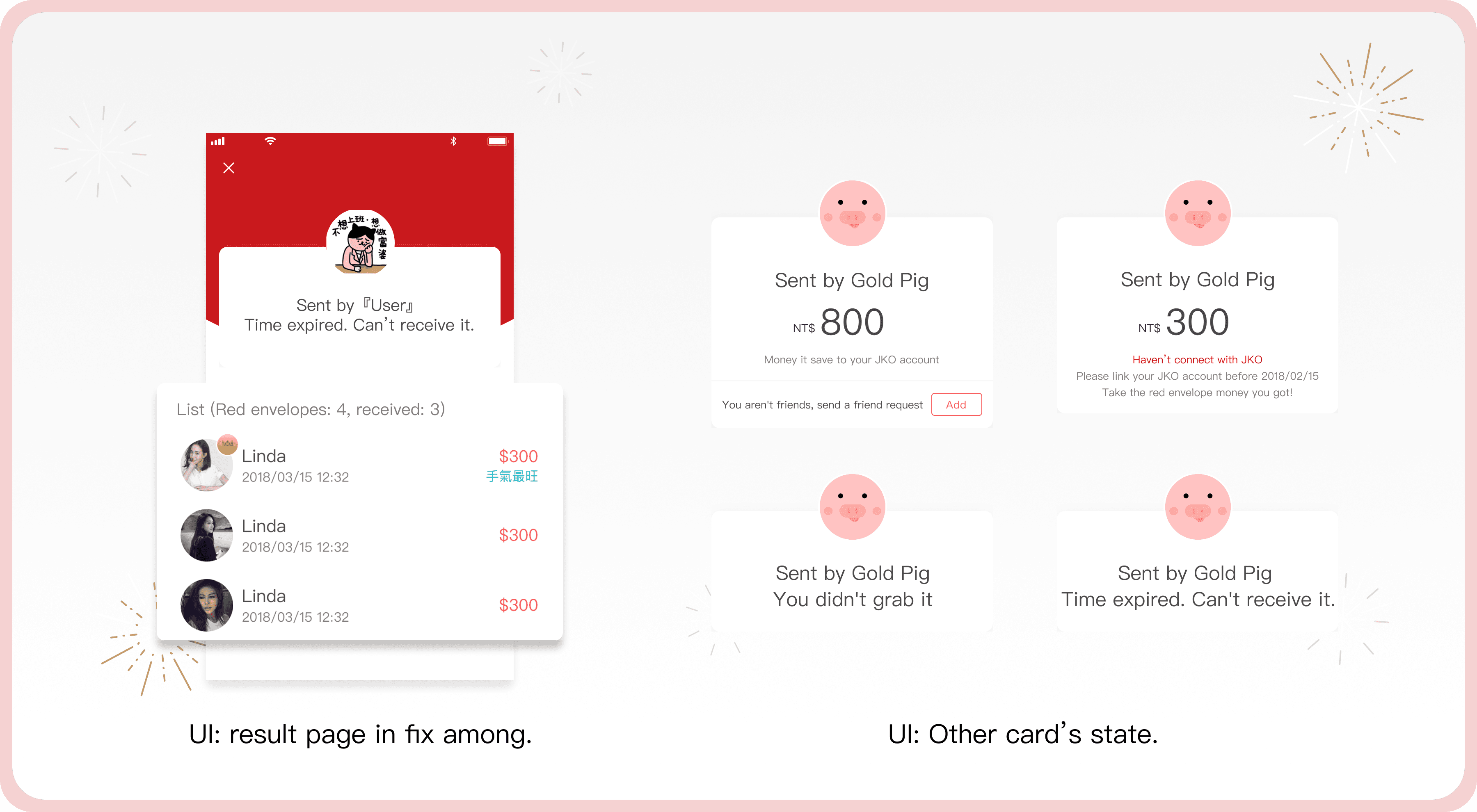
Key Projects: Red Envelope
To celebrate Lunar New Year, we launched a limited-time red envelope feature to attract new users and boost engagement among existing ones.
I designed a digital red envelope experience that let users send money with a touch of gamification.
The feature supported both fixed and randomized amounts — making it more fun to share with friends and creating a more engaging, social interaction around gifting.
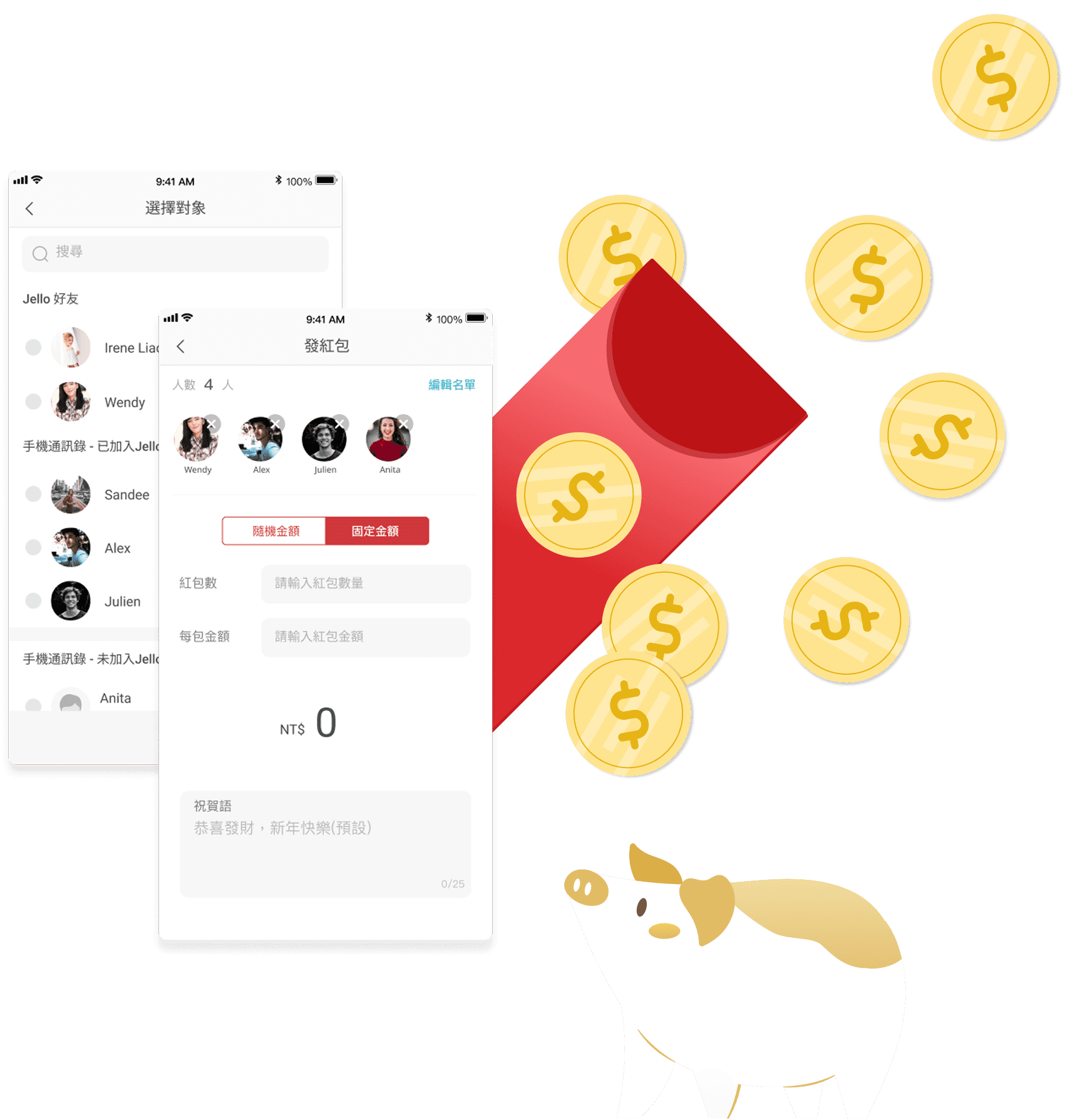
The challenge was a tight timeline; I only had 3 weeks to design and launch. 2 weeks for the second-hand research and create a mockup and prototype and the user flow( yes, I didn't have time to do the wireframe!), and one week for UI QA, to ensure the flow it is smoothly and adjust some part of the UI to make the visual correctly.
Fixed Amount Flow
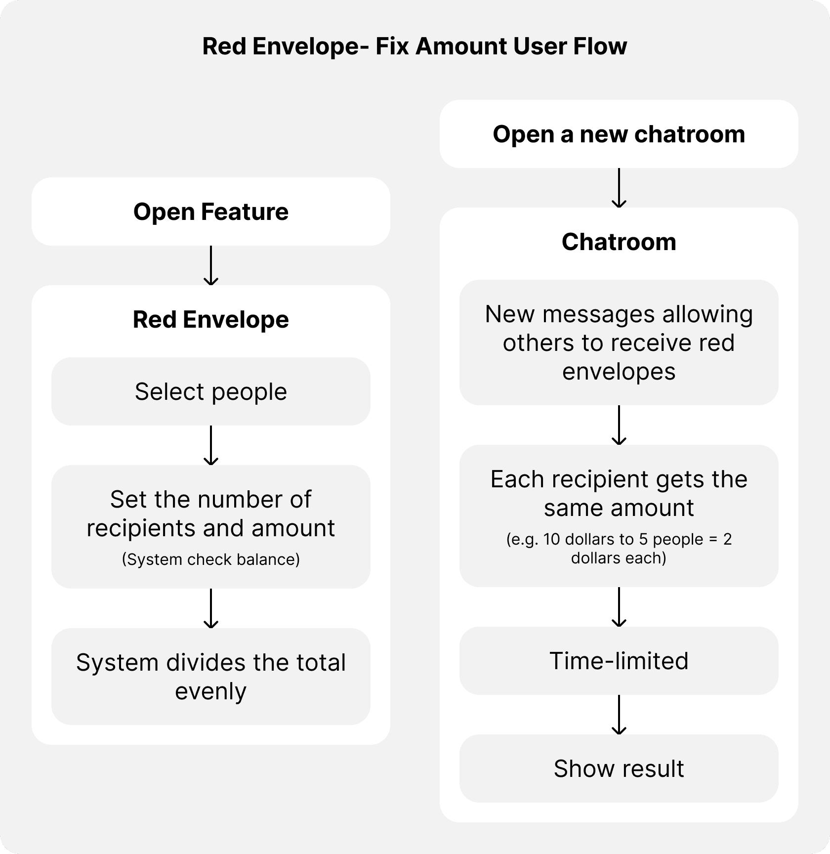
Users can send a fixed amount to multiple recipients.
The system automatically divides the total amount among recipients equally.
So it means that the people will receive an equal amount.
For example e.g., A user set to send $10 and shared with 5 users = $2 for each receiver within a time-limited (two days).
Everyone will be happy!!!
The user flow with random amount
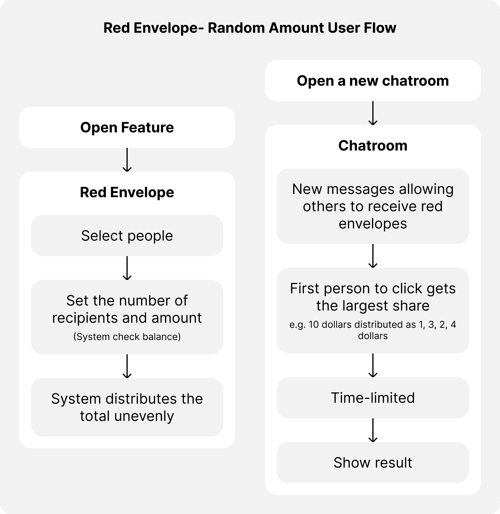
This part will be different. No matter how much money you send, the first recipient to open the envelope gets the highest amount.
It is more like gambling and will encourage engagement and add excitement.
The idea is that the system randomly assigns different shares.
For example, you set to send $10 for people, and they will receive $4 or 1 or maybe 0.5, it will be a little annoying with the people who receive less, but that will be the fun part that makes people want to do this feature again and again to earn more money.
So the idea is to make people stay in the app longer and make them get used to using mobile to transfer their money.
A few UI screens from the red envelope flow.
This project was fast-paced but really memorable. Still love how playful (and a little chaotic 😆) this part of the app turned out!
Style Guideline
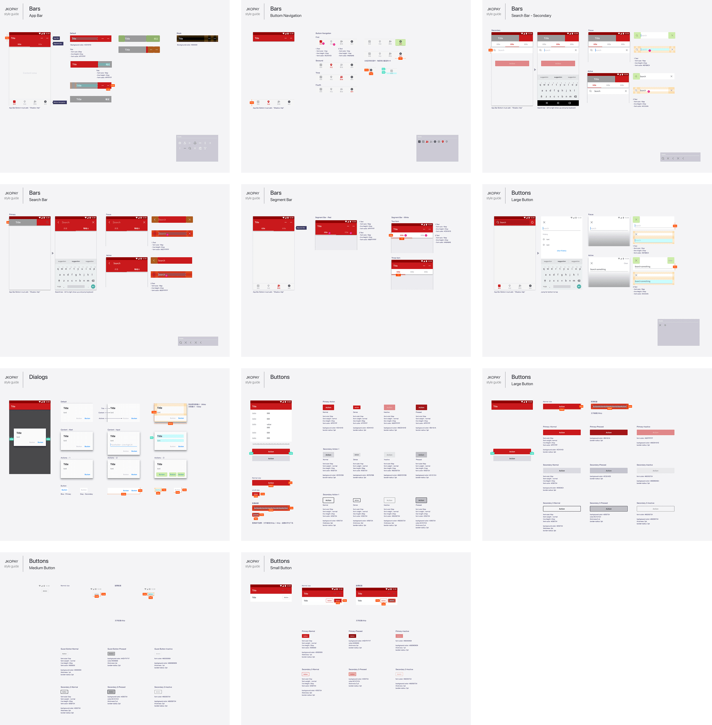
At that time, I was also responsible for creating and maintaining Android-specific design files and guidelines to ensure platform consistency.
While the product had separate designs for iOS and Android, my colleague (another designer responsible for iOS) and I had weekly meetings to align and maintain cross-platform consistency while allowing necessary adjustments for each system’s unique interaction patterns.
For the Android version, I strictly adhered to Google’s Material Design Guidelines, ensuring a seamless, intuitive, and native experience.
This process involved refining navigation flows, standardizing UI components, and optimizing user interactions to align with Android’s best practices.
Real-World Delivery: From Idea to Launch
At JKOPay, the design delivery process was highly structured due to strict financial regulations and fast-paced development cycles.
After receiving verbal requirements from PMs and the CEO, I translated these ideas into complete user flows and visual mockups using Sketch, validating each flow step by step.
Once confirmed, I created detailed spec documents for developers, including layout annotations, interaction behaviors, and component guidelines. I shared these via Zeplin and held sync meetings with PMs and engineers to finalize feasibility and handoff.
Post-implementation, I conducted independent UI QA by reviewing new builds, identifying visual or flow inconsistencies, and submitting update requests within a one-week feedback cycle.
Conclusion
JKOPay was my first full-time role focused on UI/UX design, from redesigning existing flows to creating new features. It was an exciting opportunity to improve usability, streamline payment experiences, and align the Android UI with platform best practices. (I was also responsible for both iOS and Android design for the Red Envelope project.)
Following the launch, the platform saw a 20% increase in active users. While we didn’t have tracking in place to isolate metrics by feature, the overall growth and reduced complaints confirmed that the design direction aligned well with real user needs.
View All Case Studies