Top
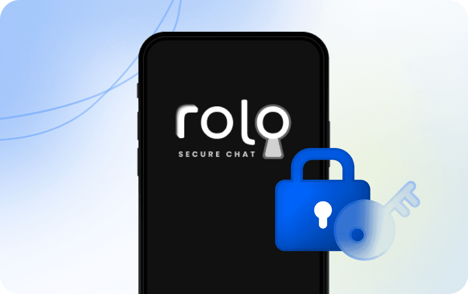
Rolo
My Role: UI/UX Designer
Led UI/UX design improvements, enhancing usability, development efficiency, and user experience.
About Rolo: Rolo is an end-to-end encrypted communication software designed to prioritize privacy and data security. It ensures user anonymity by not sharing data with third parties or tracking online activities, providing a fully safeguarded communication platform.
When I joined, the product was in its early startup phase, with development primarily led by the CEO, who had extensive experience as a product manager at IBM. As the project evolved, the team recognized the need for more structured design documentation and workflows to enhance efficiency. To address these challenges, I introduced built design system that streamlined development and improved cross-team collaboration.
Challenge
The design team was struggling with inconsistent UI patterns, duplicated efforts, and time-consuming handoffs, which made it difficult to maintain product quality across different case types.
There was no shared component library or alignment between design and engineering, resulting in a longer development cycle and repetitive fixes.
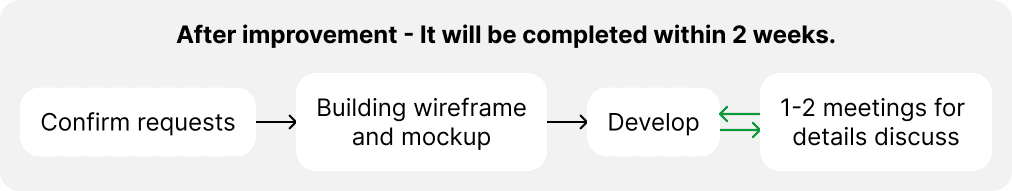
We needed to establish a scalable, reusable design system that would streamline both design work and communication, allowing the team to deliver faster while maintaining consistency.
Results
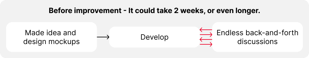
By introducing a scalable design system and reworking the case handling flow, I helped reduce the overall task resolution time from several weeks to just two weeks.
The streamlined UI patterns, shared component library, and consistent visual logic significantly improved the design-development handoff and reduced design inconsistencies.
After implementation, the product team was able to iterate faster and maintain UI quality across multiple projects without rework.
My Role & Collaboration
As the lead product designer on this project, I initiated the shift toward a centralized design system to resolve fragmented UI and misaligned workflows.
I closely collaborated with developers to ensure seamless integration of reusable components, and co-created usage guidelines to reduce back-and-forth in handoffs.
I also suggest design reviews in the QA process to ensure align stakeholders and improve design quality while respecting dev constraints.
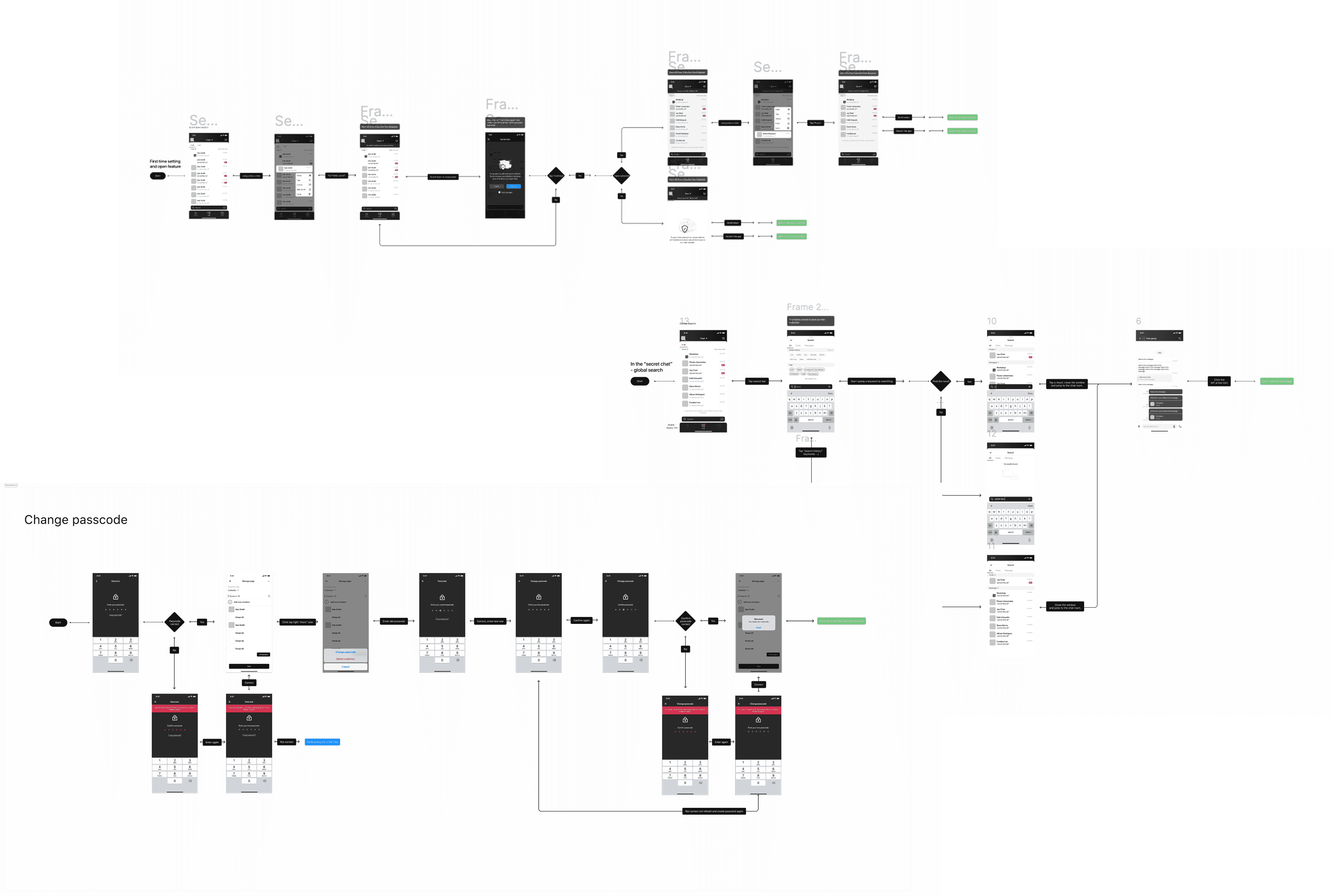
How a Design System Transformed
Our Workflow
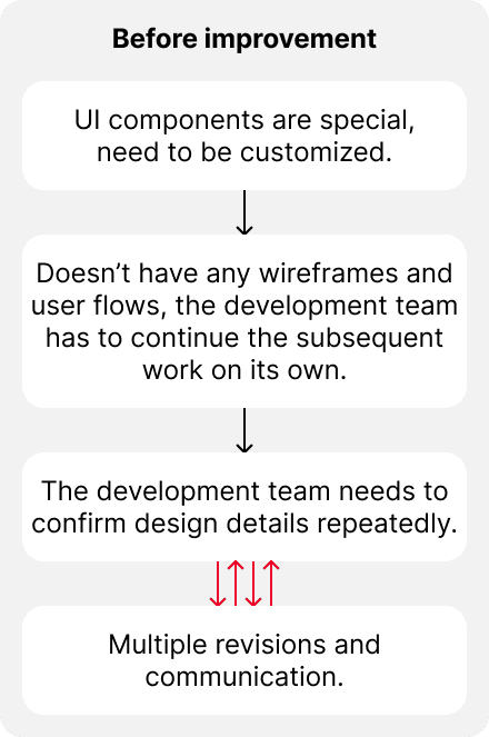
In early stage, development relied on basic prototypes with limited specifications, which increased the complexity of state management for developers, slowing progress and raising their workload.
At that time, the product had fewer than 100 users, and the team was under pressure from investors seeking growth before further funding.
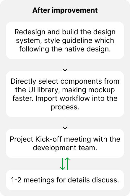
To address these challenges, I collaborated with developers to build a comprehensive component library covering UI specifications for iOS and Android.
By reducing UI customization and design ambiguity, the system helped frontend engineers work more efficiently with backend developers, allowing them to spend more time focusing on core features like encryption and secure data transfer.
Improved Design Benefits:
Increased component reusability
Enhanced consistency across designs
Accelerated development cycles for new features
Strengthened collaboration between teams
Design Delivery & Engineering Collaboration
To ensure the design system was developer-friendly and ready for real implementation, I collaborated closely with engineers during the build-out phase.
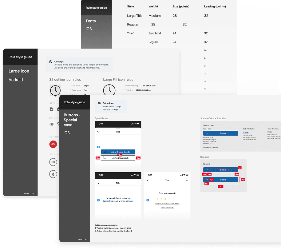
I structured components in Figma with a clear naming hierarchy and layout logic that mirrored frontend code patterns, which simplified mapping during handoff.
I also documented component states, behavior rules, and edge case handling to reduce ambiguity during implementation. This made it easier for engineers to integrate the system and maintain consistency, even as the product scaled.
Led a junior to building the design system
As the company expanded, I took on a mentorship role for a newly hired designer transitioning from another industry. I guided her in applying design principles, constructing UI components, and understanding design logic, helping her quickly adapt to the team’s workflow.
Together, we focused on creating accessible, developer-friendly components, leveraging iOS and Android design standards to improve efficiency. This not only accelerated her learning curve but also strengthened the team’s ability to maintain a cohesive design system.
Before her arrival, I had already restructured the product’s interface and established comprehensive design guidelines. These guidelines standardized key UI elements, colors, buttons, typography, ensuring consistency across iOS and Android. As a result, the design process became more streamlined, and collaboration with developers significantly improved.
The idea of naming color
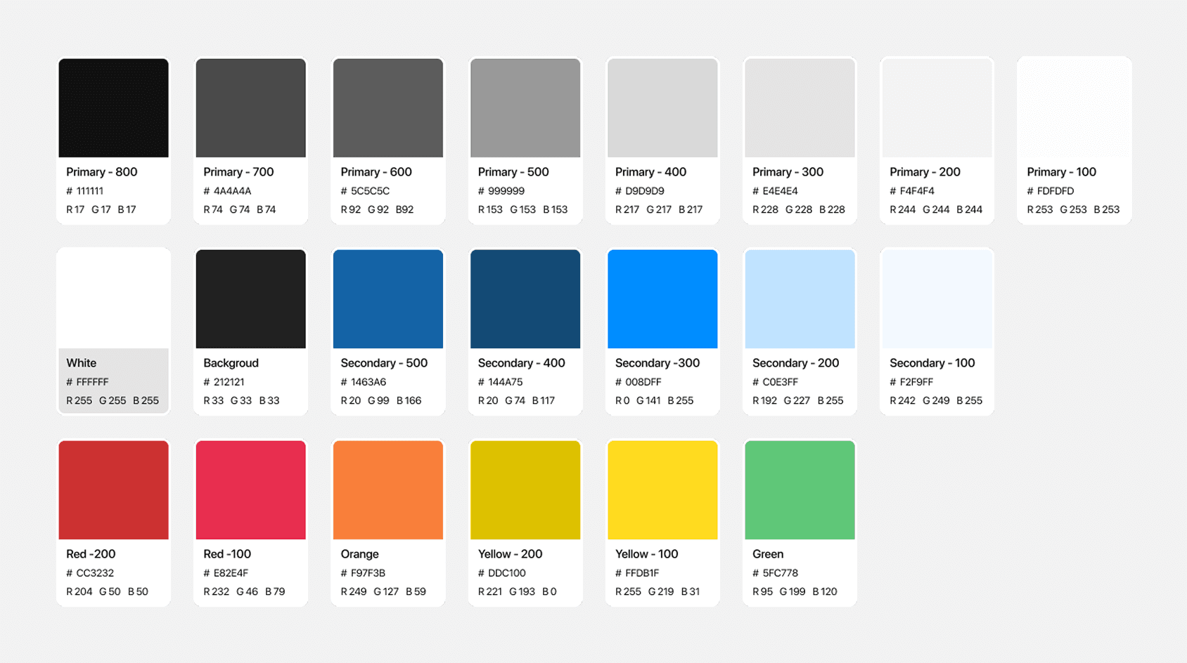
Designing the color system for an end-to-end encrypted communication app required balancing functionality with brand identity. Targeting professional users in a business context, I selected deep gray (#222222) as the primary color to convey security and reliability.
To balance this seriousness, I added brighter, warmer accent colors like red and yellow for interactive elements, introducing a touch of vibrancy to the interface. This approach maintained a professional tone while making the app feel approachable and modern.
The color palette follows a consistent naming convention:
Primary colors are in grayscale, ranging from 800 (darkest) to 100 (lightest).
Secondary colors are in the blue spectrum, also ranging from 500 (darkest) to 100 (lightest).
Other accent colors include red, orange, yellow, and green.
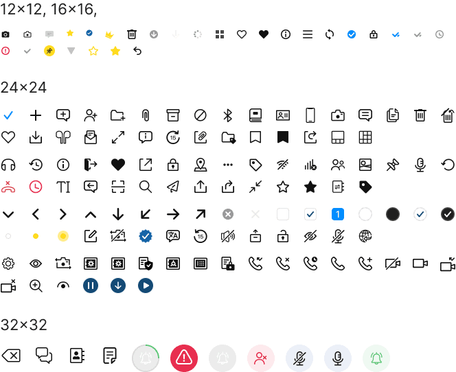
The idea of designing icons
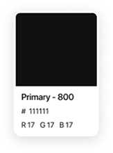
Previous Icon
The previous icons were either 30 or 28 pixels in size. They were solid with different shades and featured various styles. While they looked fine individually, they caused visual confusion when integrated into the interface.
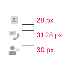
After updated
I standardized icons into four sizes: 12, 16, 24, and 32 pixels, applying solid icons in the primary color for visual consistency.
The 32x32 px icon example has edges at 4 px, while 24x24 px icons have 2 px edges. Round corners are set at 2 and 4 px, with edits scaled to 25% (128x128 px) for clarity.
Updated Icon Design
The idea of redesign UI
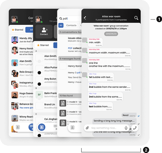
Previous UI
The icons featured creative elements, making them less intuitive and slightly disrupting the visual flow.
The bottom design used a fully customized, transparent interface, demanding significant development time and resources.
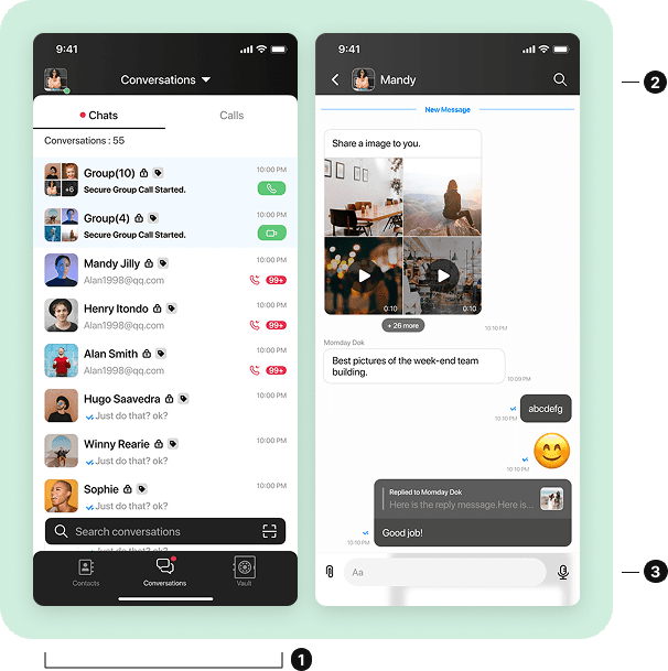
After updated
The redesign aligns with native guidelines, with adjusted components optimized for front-end development.
Icons were redesigned in a consistent solid line style, improving visual clarity and design coherence.
Enhanced the chatroom interface by increasing color contrast between message boxes, boosting readability and user experience.
UI/UX-Driven Growth & Efficiency
I persuaded the CEO to include user flows and detailed development documentation in our workflow. After that, it helped identify areas for optimization and improved communication with developers and investors. The documentation also made it easier for team members to handle the many custom design requirements.
Conclusion
This role allowed me to oversee the entire process, from early-stage design to development and presenting the product. I contributed across multiple roles, ensuring the product’s success and team efficiency.
The product redesign and launch resulted in a 20% increase in user numbers. A strong team collaboration and a shared commitment to innovation drove this success.
View All Case Studies